digi-maa

Relig Global

Logo Design & Re-designing

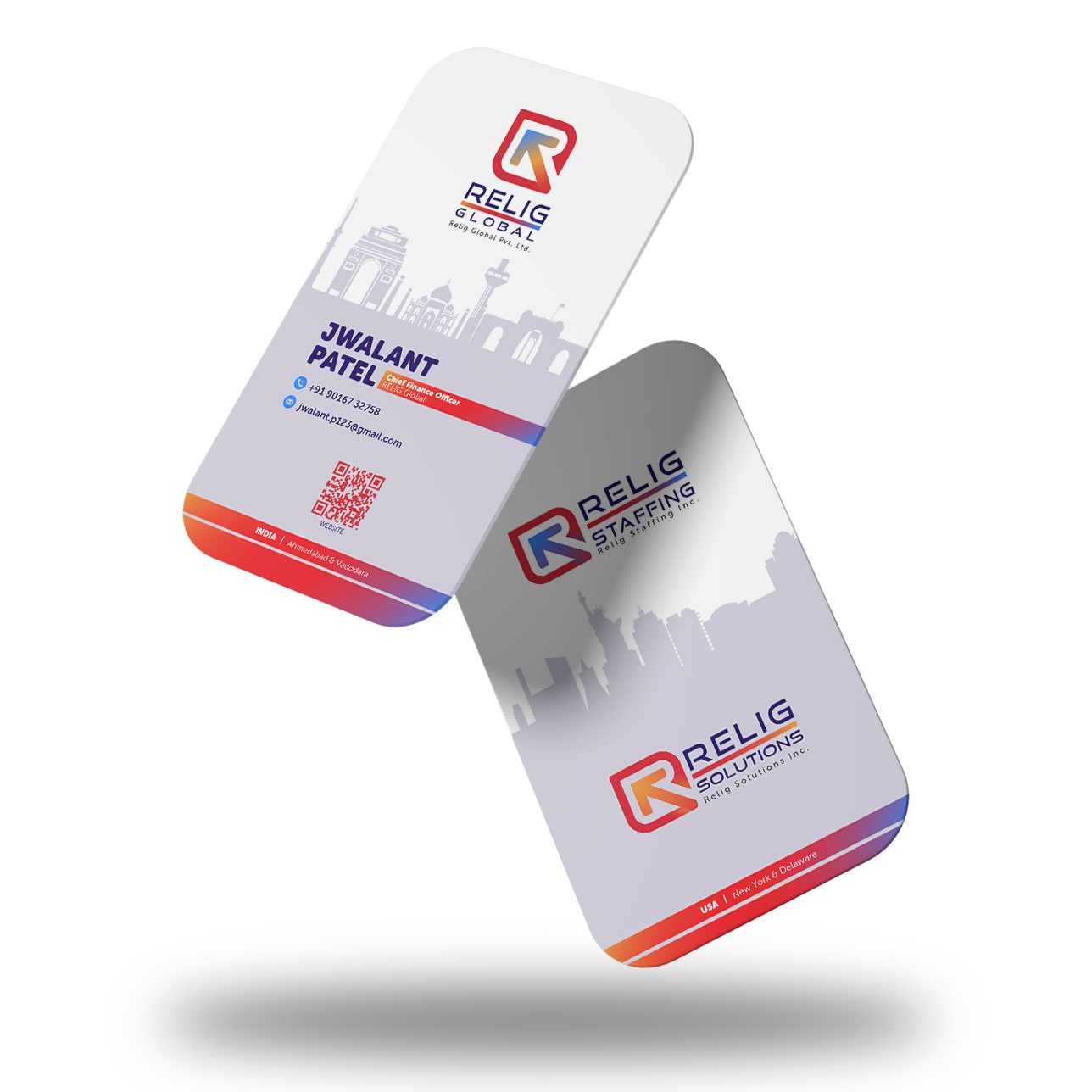
Relig Global, the parent company of Relig Staffing and Relig Solutions wanted to create a separate identity for both their ventures, keeping them intact and relatable with that of Global’s logo.

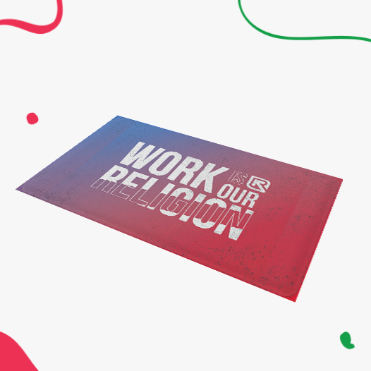
As religiously as they worship work, the same way they care for their people too, i.e. as a Family. We wanted to show the same passion in our design and colors, hence symbolizing it with the Deep RED and blending it finely with the Deep Blue that conveys harmony within the team; working in tandem for Relig Global while being the distinctive self for the two ventures! The minimalistic approach defines the simplicity and transparency in their work culture and also reflects how our clients feel about working with us!

Relig has always stood as a family and will be standing by each other and growing together, this symbolism is being shown in the logo as the growth will always be upward, together, and an amalgamation of all!

Business Card & ID Cards

Since Relig has its operations based in the United States, the brief for the Business & ID Cards was to create a design that could incorporate all three vertical’s logos as well as give an essence of its presence in multiple countries.

Hence, we thought the best way to present this would be by incorporating line art of some of the famous monuments in India and the US. We placed the logos and art in such a way that one side of the card focuses on the company’s roots laid back in India and the expansion on the other side.

Brochures & Company Profile

Relig Global wanted to maintain its brand elements and aesthetic throughout the business assets. Hence, we designed the Brochure and Company Profile keeping our design space in the foreground; thereby bringing consistency in the overall Branding essentials.

Going with the same thought ahead, we created the other brand assets with the dedicated design space for the company:

  • Mouse Pad
  • Letterhead
  • Envelopes
  • Emails
  • Invitations

Calendar Design

The company asked for a calendar design that represented the coming together of ‘India- US’.

We were sure we wanted to play around with the monuments by developing a connection through a ‘Message’. Thus, we began with fixing a theme for each month, which could also signify the culture and ethics of the company. We then researched for relevant monuments and prominent spots that could blend in well with the concept as well as had a point of intersection with each other. The customized element in the form of individual names seamlessly being incorporated into these places, was executed with utmost precision. Each month is well thought out and wonderfully executed in the form of a Calendar.

Website Design & Development

Taking the logo gradient inspirations forward, we designed the website keeping a distinctive design space in mind. For the parent company and its ventures, we designed the website with specific elements for all and developed the website along with the service functionalities and content for the same.

We Are Global